RIVER THAMES - Public Awareness Campaign
This brief requires us to create a striking, public awareness campaign including one element of the River Thames . It may be commerce, leisure, environmental, public, private, social, community etc. It can be a positive improvement or negative decline. It must have a strong visual impact in black and white. In the video there's to be no sound added but include beginning and ending titles in the space of 15-30 seconds. The three photographs must be presented as a leader board banner (720 x 90 pixels)
"At their most effective, public awareness films resonate with audiences long after the credits have rolled. The subject matter can be hard-hitting or uplifting, but in either case the message must be clear and conveyed with conviction."- Omni productions
First two Public awareness videos that I've come across that I've liked
Think Road Safety, Live With It
It's a chilling TV ad that shows the life-changing consequences of being involved in a fatal road accident, from the driver’s point of view. It's a really simple idea yet so effective. It'd be a simple concept to recreate the only issue would be finding the locations and having a wide range of locations for the editor to mix it up with.
NHS Smoke Free, Every Cigarette Rots You From The Inside Out.
Within this TV ad we are shown the disgusting life threatening side of smoking. Although graphic and unpleasant to watch, this film has a strong message that cannot be ignored. The powerful use of the art department is what makes this such a striking public awareness campaign.
This Girl Can, What About You?
This empowering film celebrates women in sports and encourages its audience to “sweat like a pig and feel like a fox.” Although it's a longer video than I'd be allowed to create it's a great example of a positive public awareness campaign.
Rubbish Public awareness campaign
#FFS London- Hubbub campaigns
This is a really exciting short campaign about the thames which I think although really eye-catching is actually very factual too. Although it's an animation, which I can't do for my brief, it's still very inspiring due to its speedy storytelling, bold colours and the layout between the writing and imagery. It's short and snappy making it an easy digestible watch targeting at all ages.
Public awareness campaign about the Thames
Thames historic Barge race (Port of London)
This is a documentary styled public awareness campaign that uses a mix of interviews and B-roll. Interviewees were the participates and the public watching the event and B-roll which involves footage of the race and nice shoots of the Thames. My favourite element is the 20 seconds after 1minute55secs, during this period the editor uses some old footage.The old footage is black and white with an added graininess which is only there due to it being old film footage however, I could add the effect through premier pro.
Motion content in Fashion
"Iris" is a fashion video by Barnaby Roper
"Iris" is a fashion video by Barnaby Roper. I chose this video as it's unique compared to other fashion videos due to the use of post production makes it such a powerful film to watch. Combining the movement of the model with lines edited by the post production team creates an edgy abstract aesthetically pleasing video to watch. This inspires me to experiment with the editing whilst creating this video. Currently, I'm thinking where they used parallel lines in this fashion film, I could create waves using the same visual effect. Making it waves to reflect the thames.
"H&M loves Coachella"
This a beautifully filmed video, following the models around America in both the cities and desert. The main thing that inspired me from this video was the use of time lapses and different locations. There's only a few time-lapses but they all capture the feel of the place with the colours and short sharp speed of them. They add an extra excitement to the videos grabbing the viewers attention, they're also never straight! Seems like they're purposely slightly diagonal and going in and out of focus which adds a warmth to the video. It inspires me to use a time-lapse in my video as it could represent the thames clearer. Additionally, in the video they use at least 5 different locations and they're all very different which contrasts well within the video. The power of using a great location can completely transform a video from a dull narrative to an interesting visual.
Motion content in advertising
Acurar "Human race"
The key reason I choose this video was due to the format of the video- the fact it was a horizontal rectangle which is similar to what I have to do for mine. Due to this they use the rule of thirds to ensure in one third there is always something happening in the video. Forcing the viewer to focus on the whole area rather than just one corner. This video helps reflect how much I can still do with my video even with the format limitation.
Mercedes-Benz- "The Journey"
What I found so eye-catching about this video was the use of the wide lens. Following the little boy around the city, the use of the lens reflects the huge beauty of where he is and adds extra length to the journey. It makes the journey feel longer than it may actually be due the wide shot. It inspires me to think carefully about what lens I use when filming as it can completely transform the original narrative of the footage.
Narrative motion content

It's a music video which tells the narrative of the song visually through actors. The story of a awkward boy trying to get with a girl, it's a humorous romantic short story that can be told without the music which shows impressive story telling.

Another music video where the visual and audio is almost exactly the opposite- there is a little link between the two but it's tiny! The visual is a girl dressing as a boy to be a part of the army whereas the song is about being strong and proud of being who you are. However, they're two different messages, the motion content story is very clear which is inspiring.
Public awareness campaign photography

Mithila Thople
Thople was given the brief of creating a poster campaign raising public awareness about the importance of talking and reading to young children. I love the combination of the bold primary colours with the silhouettes of the main subjects, they contrast well together to create an eye-catching poster. The posters represents the power of silhouettes and inspires me to use them to or using a similar concept where you can't see the details of the model. Public campaigns need to be bold, just like these posters, and that can be done by controlling the colours.
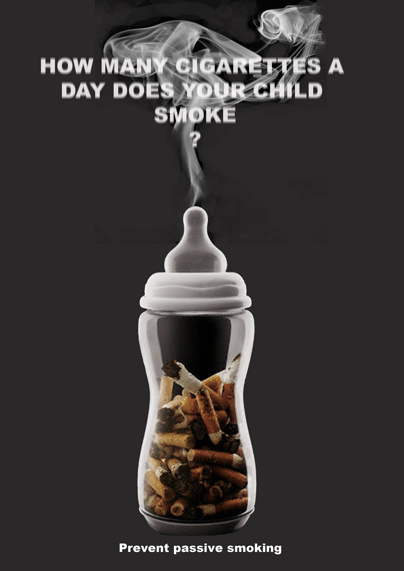
Anti-smoker poster found on Pinterest
This poster is devised for an anti-passive smoking awareness campaign and I believe is really effective. Targeting it at parents is smart as they can use guilt as way to attack their audience which they do effectively here by using a baby's bottle. The lighting hitting the bottle works nicely at highlighting, making it the prime important subject on the poster. My only critique is the text. Sadly, at the top of the photo the text and smoke blend together which makes the rhetorical question less effective as it's hard to read. This is an important factor for me to take into account when creating my own public awareness campaign as the text is normally one of the most important parts.

"Cocaine gun" by the Partnership for a Drug-Free America, 1987
This is a terrifyingly effective bold awareness poster. It has a clear bold statement that can't be ignored. In all three images the eyes are big and staring directly in the camera which is intimating for the viewer because the eyes feel like they're following you... The use of black and white develops the eerie vintage horror affect which is something I could develop into my own work. We have to make our film black and white, if I was to use the black and white to add to the atmosphere, it could make the film more powerful and effective.
Photography

This style of photography is my key inspiration for my three photographs for the public campaign! I love the composition with the strong depth field as it draws the audience's eyes straight to the bottle and then to the location. Clear and bold message!

This is an exciting piece of public campaign awareness photography- it's comedic yet serious, making it eye-catching for the viewer. They trusted completely on the location and outfit to make this photo strong as the lighting is only from the sun rather than studio lights. Luckily they're fine as it was such a sunny day but technically not compelling.

I really like the simple style of the product photography in this photo. The strong use of bold colours contrasting with the text which makes it exciting.

I like the mix of studio and locational photography in this piece of advertising. The studio photography is strong with the lighting creating a big shadow giving the image depth. With the background locational photo being busy and exciting.
Article

Mandy Baker
I love the concept of this photo series- simple but tells a strong and powerful message. The photos from first glance look beautiful so it's misleading when you look closer to realise it's actually rubbish.
Visual artists
Page on Pinterest

I found a whole page on Pinterest which is dedicated to showing people's art work created only using litter. Varied from clothing to structures to paintings. It's really mad what people can create out of litter. Its inspiring as it's another route I could go down to represent how much rubbish is in the Thames. Create something out of the rubbish I find in the river and photograph it!
The River Thames
The River Thames is a river that flows through southern England including London. At 215 miles (346 km), it is the longest river entirely in England.

When looking online for River Thame campaigns that had already been created. Only five suggestions appeared;
1- LITTER!!!
2- Sewage pollution
3- Transport
4- Vulnerable river users
5- Building bridges
Out of the five suggestions the two I like the idea's of are; transport (presenting all the good transport that's already there or getting angry that there's not enough.) Or vulnerable river users (human's safety)

Another key element of this brief is ensuring that the film is presented as a leaderboard style ad which will hugely impact what I film as it'll need to fit in this layout. It'll be a very horizontal look which influences wider stretched landscape footage more so than the usual square look of a film.
Film planning
Initial brain storm of ideas;
Idea 1 (link to rubbish in the thames)

The basic idea of this film idea was to show the beauty and ugliness of the thames. Creating a huge contrast between the two so that the rubbish seems even more shocking! This will be presented by following a bright red ball (the subject can change) following the red ball it will show the beautiful landscape that you see whilst walking along the thames- it'll be quick and be in the style of a time-lapse. After 10 seconds the ball will, in slow motion, jump off the bridge to reveal in the next shoot the ball in a pile of rubbish. The subject should almost jump out of the picture compared to the disgusting rubbish. Ending with some harsh blunt text along the lines of "stop chucking your rubbish into the thames blah blah blah..."
Just remembered in the brief it has to be in black and white... I feel like this will be a lot less effective if it doesn't have colour as I want the ball to stand out throughout.
Inspired by Fiat 500 Viagra advert
As well as being a humorous advert, it's also I really well done ad. I loved the idea of following the viagra pill around the quiet beautiful little town- which would be simple to repeat. I believe the way they did was by filming the elements of the town and action around the town people and during the post production process edited in the pill. However, it's so well done that you feel as the audience that the camera is literally following the pill. The narrative of the ad is something I'm inspired by.
Idea 2 (links to vulnerable river users)

The film will start with a man/woman's face- preferably from the bottom of the nose to the top of the head and slowly moving into the face to end with just with the two eyes staring out the camera. Throughout this slow zoom in, waves (from the thames) slowly become more visible from within the subjects eyes until eventually popping out completely and making the whole screen one big wave explosion. I want the waves to go from one big explosion to a calm peaceful speed with bold text over the top saying something along of the lines of "be visible whilst on the thames blah blah blah..."
This film is creating awareness about vulnerable users on the River Thames. I feel if I use strobe lighting whilst slowly zooming into the eyes it will create a spooky, dark feel to the footage so that when the waves explode out of the eyes it will jump scare the audience. This is a short punchy film which should leave an impact on the viewer.
Idea 3 (links to rubbish)

This film starts with the calm river thames looking beautiful and clean, until someone throws a piece of rubbish. It starts with one piece and slowly more and more gets added until there's 6/10ish pieces on the water. After, it's super quick and loads gets added until you can barely see the sea. It goes white and presents a rhetorical question to the viewer- whether they want their thames to look like a pile of rubbish or beautiful and clean. Aiming to encourage the public to put their rubbish away rather than throwing it in the thames. It's a pretty simple idea but I feel like it could be really effective!
My favourite idea is number three. I believe it's a simple yet effective concept and relevant to today's problems with litter which is why I'd really like to do it. Additionally, I believe it'll be easy to create in both the filming and editing process once I create a solid plan...
Film Mood board

Rough plan

8th February
From the meeting with my lecturers, I've decided I'd like to combine idea one and three together. The idea being that we follow something (e.g a bottle?) and as it travels along the river thames pieces of rubbish slowly fall off into the thames. It's a slow build up until the end when the subject we follow falls into the pile of rubbish and boom shock!
Location Recce (Monday)
I want an area that's just empty water where I can put my camera on a tripod and have as it as a birds eye view of the rubbish.

Detailed storyboard


Equipment list
- DSLR Canon EOS600
- Lens 50mm
- Tripod
Props List
-Bag of rubbish
First draft
I like the layout of the sequence and speed, however my next step to improve this is changing the colour balance. It's currently very grey and I want to make it more "black and white" and increase the contrast.
Second draft
I was really happy with this second draft until I noticed that the brief specifies that there should only be titles at the beginning and end as we shouldn't need words to explain our message...
The final completed video
Review
Although I kept the video very simple I believe it works effectively! It's a very digestible 30 seconds which would appeal to a large ranging audience which is vital for a public campaign.
I'm really happy with edit as it's really smooth and flows nicely. I'm even happier with the colour grading as it's the first time I've ever done it and it looks fairly professional.
I wish there was more of a range of rubbish in the video as there's only four different items, however this was because these were the rubbish pieces I collected on the beach by the Thames. This kept it as realistic as possible which was very important for me. Next time I'd chose a more interesting concept to focus on as rubbish was quite a dull choice so I was limited with creativity.
Photography ideas and planning

Photography mood board

Drawn ideas of the photography ideas

Coloured ideas drawn

Test shoot

For all three of these I'd flip the photos so that the objects are on the opposite side of the writing.
The key thing I learnt from this shoot was how long and vertical the layouts actually are! This will require me to use a wider lens next time rather than my 50mm.
From this practise shoot and many locational recees I discovered how hard it is finding the perfect place to find a load of rubbish right by the Thames. So I've decided I'll book the studio and grab rubbish from the Thames and do a product photography shoot. Just like Dan Kitwood:

Equipment list
- DSLR EOS600
- Lens 35-80mm
For lighting I'm constantly checking the weather forecast as a long as it's not too sunny there'll be no bad shadows and obviously as long it's not raining so equipment doesn't get damaged. Due to this I decided not to book out equipment and luckily this paid off!
Photo shoot

I've placed all the photos I was happy with, within the layouts before editing. This helped me narrow down the photos I wanted to use so I can start editing ones that will actually work rather than 20 different ones.

Here are my three final images I've chosen for my Thames photography. I've slightly edited them but now I need to complete editing and then crop to the composition that suits the layout.
Review
Taking photos of rubbish in the Thames sadly wasn't very exciting and I was very limited with creativity due to my public campaign choice. Although with the limitations I believe I created some effective and clearly messaged photos.
Next time I would've chosen a more exciting concept so that my photos would've been interesting. Additionally, I chose a public campaign that is being addressed by the government currently meaning that finding a location was actually very hard! Areas that were originally covered in rubbish are now cleared which actually made this brief very hard!


